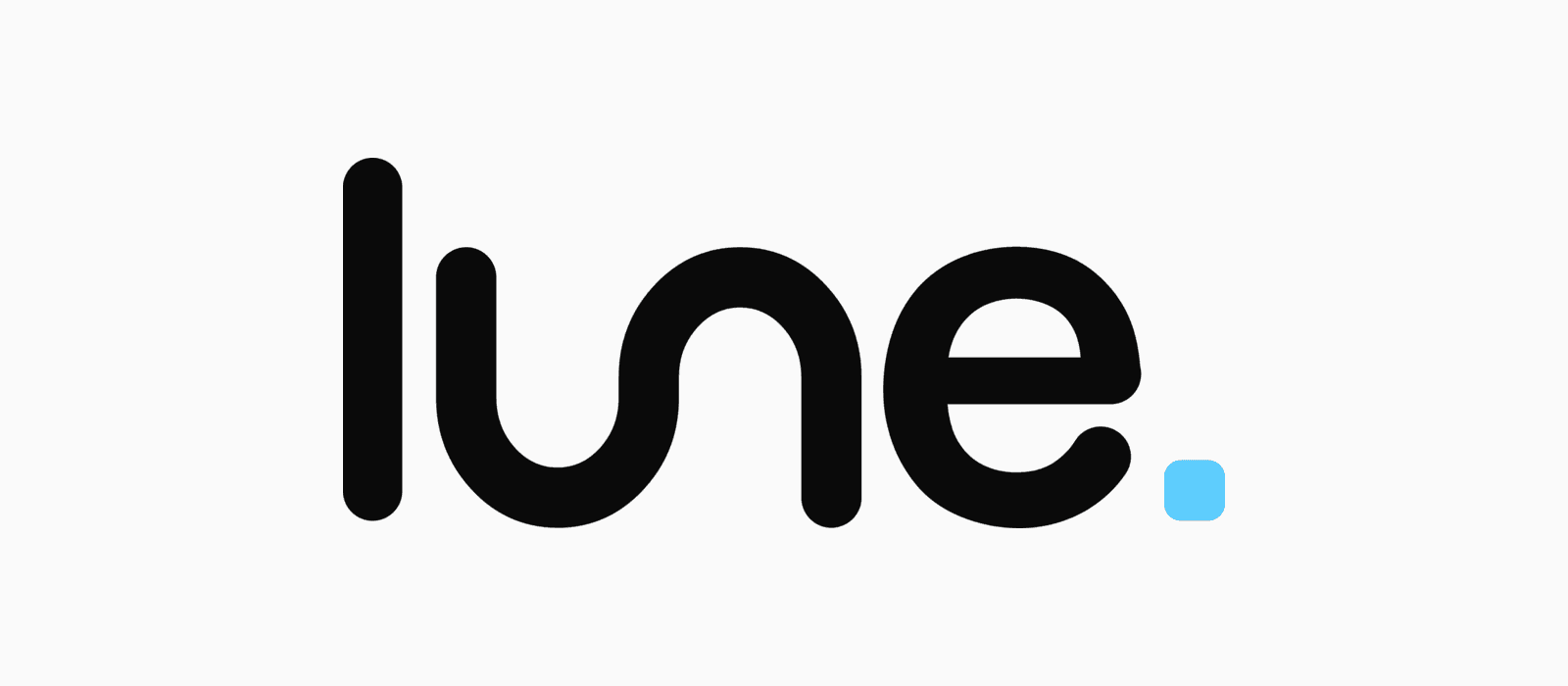
Lune Studio has a new logo. The “u” and “n” in our name are now drawn as one continuous line, shaped like two bends of the River Lune, the river our studio is named after. Alongside the new wordmark there’s a standalone symbol, a refreshed favicon and a full brand pack. This article covers why we rebranded, what the new logo means, and the checklist we followed to roll it out without losing a scrap of search visibility.
Where the name Lune comes from
Lune Studio started in Lancaster. George founded it while he was studying at Lancaster University, and the very first clients came from an old-fashioned approach: flicking through the Local Choice magazine, finding businesses whose adverts had no website, and ringing them up.
The River Lune runs right through that part of the world, flowing between Lancaster and Morecambe out to the sea. It felt like the right name for a studio that started on its banks. A year on, we were working with some of the biggest names in Lancaster, almost entirely through referrals.
Today we’re headquartered in Market Harborough, with a small team of developers and clients across the UK, Europe and the US. We’ve moved a long way from the river, but the name has always stayed.
Why we rebranded
The old logo did its job. George designed the original “lune.” wordmark himself, and a later refresh made it sharper and narrower with a square full stop. But it was still, at heart, a word set in a typeface. Anyone could have typed it.
For a studio that designs and builds brands and websites for other businesses, that never sat quite right. We wanted a mark with an idea inside it, one that told our story without needing a paragraph of explanation.
The idea had been sitting there for years. George had long wanted to join the “u” and “n” into a single flowing stroke, like the river itself. This year we finally did it properly.
It’s a subtle change, and that’s deliberate. Put the old logo next to the new one and plenty of people would struggle to spot the difference at first. We’re fine with that. The studio is built on simplicity and minimalism, in how we design, how we build and how we work with clients, and the brand should say the same thing. A dramatic overhaul would have been the easy way to get noticed. A few careful lines that mean something felt far more like us.
What the new Lune Studio logo means
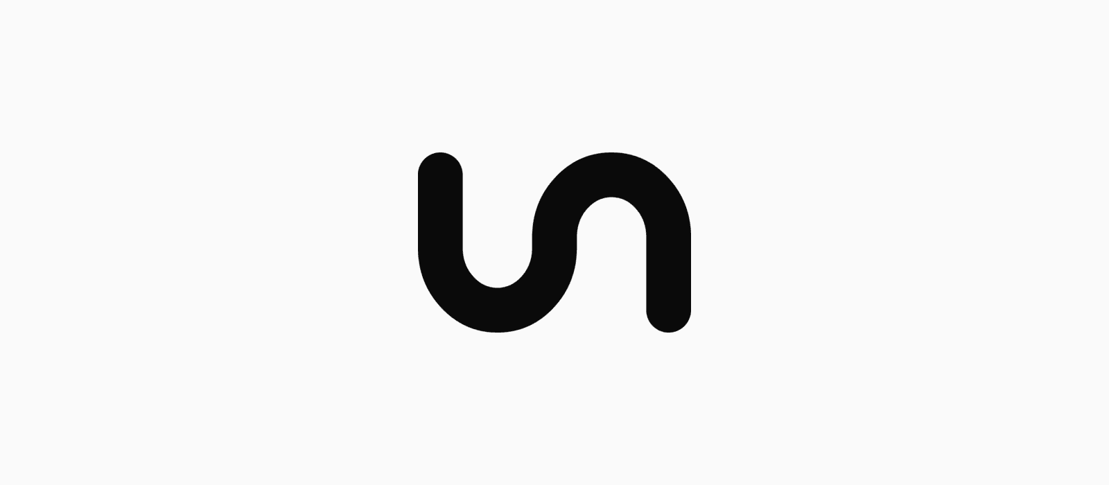
One line, two bends. The “u” and “n” are now a single ribbon of constant width, with two gradual bends that trace the shape of a river. It reads as “lune” at a glance, and as a river once you notice it.
Every end is rounded. The top and bottom of the “l”, both ends of the river and the tail of the “e” all finish in a full semicircle. We tested flat ends and sharper versions, and retired all of them. The rounded version feels calmer and more confident, and it holds up far better at small sizes.
The blue full stop stays. The square dot in Lune blue has been part of our identity since the beginning. It’s now slightly softened at the corners to match the rest of the mark. It’s the only blue in the logo, and we keep blue rare across the brand so it always means something.
A website never stops moving. That’s the quiet idea underneath it all. A river is never finished, and neither is a good website. Launch day is the start of the work, not the end of it, which is why so much of what we do is ongoing support, improvement and growth.
The symbol: our logo in its shortest form
Not everywhere has room for a full wordmark. Browser tabs, social media profile pictures and app icons need something smaller, so the river now stands on its own as the Lune Studio symbol.
On our favicon and social avatars it appears in white on Lune blue. We’ve deliberately kept it small within the square so it survives the circular crop that LinkedIn, Instagram and most other platforms apply to profile pictures. It’s a small detail, but marks crammed to the edge of a circle are one of the most common ways a brand ends up looking cheap online.

The rest of the identity
The logo is the headline, but it sits inside a system we’ve kept deliberately simple:
- Colour: near-black ink, soft paper whites and Lune blue, used sparingly for accents.
- Typography: Manrope for headings and body text, with Instrument Serif italic as an occasional accent, like the blue words in our homepage headline.
- Clear rules: minimum sizes, clear space around the logo, and a short list of things never to do to it (no stretching, no outlines, no shadows, and never retyping “lune” in a font).
Everything lives in one brand pack, so every new page, proposal, invoice and social post uses exactly the same files.
How to roll out a new logo without hurting your SEO
A common worry with any rebrand is whether changing your logo will affect your Google rankings. On its own, a new logo has no direct effect on SEO. What can cause problems is everything that tends to change at the same time: page names, URLs, image files, and inconsistent business details across the web.
Here’s the checklist we followed, and the one we use when we rebrand a client’s website:
- Keep URLs and page structure the same. A visual rebrand is not the moment to rename pages. If a URL has to change, set up a permanent 301 redirect from the old address.
- Replace the logo file, keep the filename. Swapping the file behind an existing path means every page picks up the new logo instantly, with nothing broken.
- Update the favicon set. That means the browser tab icon, the Apple touch icon, Android app icons and the web manifest, plus a theme colour that matches the brand.
- Refresh your Open Graph image. This is the preview image that appears when someone shares your link on LinkedIn, WhatsApp or Slack. An out-of-date one undermines the rebrand every time a page is shared.
- Update your structured data. The logo referenced in your Organization schema is what search engines can show alongside your brand, so point it at the new file.
- Write proper alt text. Describe the new logo and any brand imagery accurately, for accessibility first and image search second.
- Make it consistent everywhere else. Google Business Profile, social profiles, email signatures, invoices and directory listings should all show the same mark. Consistency builds recognition and trust with people and search engines alike.
- Retire the old versions completely. Hunt down old logos in footers, 404 pages, email templates and PDFs. One stray old logo is all it takes to make a brand look unfinished.
Done this way, a rebrand is pure upside: a sharper first impression with no loss of the visibility you’ve already built.
Designed in house
We designed all of it ourselves. The wordmark, the symbol, the colours, the type and the brand pack were drawn and built here at the studio, by the same people who build our clients’ websites.
That surprises people, because most know us as a web design company. Websites are the core of what we do, but they’re not all of it. We also design brands, from a first logo to a full identity refresh, and we run paid advertising and build AI and automation for businesses that want their website to do more.
Doing the brand and the website together means they’re designed to work with each other from day one, rather than a logo being handed over and squeezed into a site afterwards. If your business needs both, or just one, get in touch.
What’s next
You’ll see the new logo rolling out across our website, proposals and social channels over the coming weeks. If you notice an old one hiding somewhere, we’d genuinely love to know.
If your own brand feels like it’s outgrown its logo, or your website no longer reflects the business you’ve become, take a look at what we do, browse our recent work, or get in touch. We’d love to hear what you’re working on.
Frequently asked questions
- Why did Lune Studio change its logo?
- The previous logo was a refined version of the word “lune” set in a typeface. The new logo tells the studio’s story: the “u” and “n” form one continuous line shaped like the River Lune, which the studio is named after.
- What does the Lune Studio logo represent?
- It represents the River Lune, which flows between Lancaster and Morecambe, where the studio was founded. The single flowing line also reflects the studio’s belief that a website is never finished and should keep evolving after launch.
- Where is Lune Studio based?
- Lune Studio was founded in Lancaster and is now headquartered in Market Harborough, Leicestershire, working with clients across the UK, Europe and the US.
- Does changing your logo affect SEO?
- A new logo doesn’t directly affect search rankings. Problems usually come from changes made at the same time, such as renamed URLs without redirects, broken image paths or inconsistent business details. Keeping URLs the same, updating structured data and staying consistent across every platform protects your visibility.
- Can Lune Studio help with my brand as well as my website?
- Yes. Alongside website design and development, we help businesses refresh their logos and bring their brand together consistently across their website, social media and marketing. Get in touch to talk about your project.
Working on something this applies to? Book a call or send over the details, and you’ll get an honest read on whether it is worth doing.